More than half of people use their phones to browse the internet. If your website doesn’t translate to mobile people are going to move on to one that does.
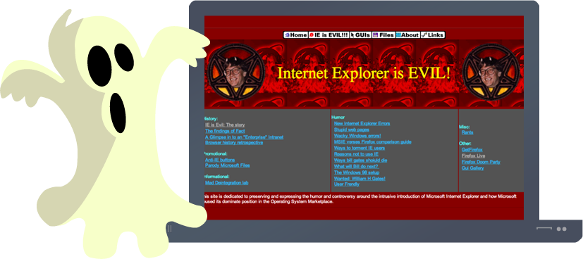
Bright colors and flashing signs do more damage to your business than good. People don’t want their eyes to hurt trying to find out more about the products or services you offer. Sometimes less is more.
If your website looks like it was designed in the 1990’s it’s telling your customers that your information may not be up to date. And if your information has a date on it that is from the 1990’s they are not going to trust the information. Ensure that you have an up to date site in design and with the information you provide.
People want to trust who they do business with. If a company has no contact information on their website they can feel that your business is not legit. Always have up to date contact information. Also, if you’re a brick and mortar store, how do you expect them to find you.
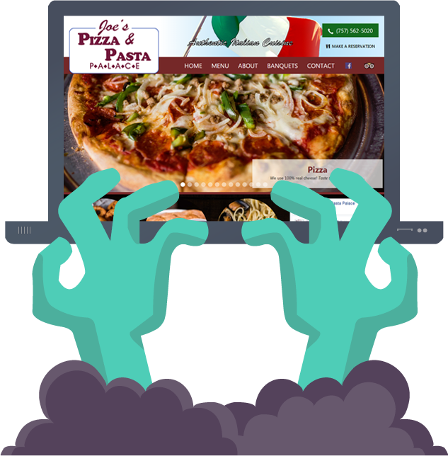
Your Facebook fan page should not be used as a website. Yelp should not be used as a website. You need to control the message you send your potential customers by having a well-designed website that shows them who you are. If you don’t have a website, potential customers will go to someone who does.

IF YOU NEED AN UPGRADE OR ARE STARTING FROM SCRATCH CLICK THE LINK BELOW TO SCHEDULE A FREE, NO-OBLIGATION CONSULTATION.
There aren't any comments yet, be the first to add a comment!